You don’t have to be an expert in comparative education to know that international aid agencies and developing countries pour a huge percentage of spending into education because they see education attainment (sometimes broadly described as “human capital”) as linked to health and, ultimately, economic outcomes. Economists and sociologists in particular spend a good deal of time working with large datasets trying to parse out the effects of completion on everything from teen pregnancy to GDP.
On an international scale this can be notoriously challenging; record-keeping quality and frequency vary enormously between countries. In recent years international organizations including the UN, the World Bank, and the OECD have made significant strides in capturing and standardizing metrics for school attainment and completions. This has been accomplished largely through growing inter-agency collaboration, particularly around the so-called “World Development Indicators.” Reflecting the strategy of the agencies since the late 80’s these indicators focus chiefly on primary school completion, and, in particular, on male/female disparities (tangentially , these are more complex than they sound. See here for one of several analyses that shows that the male/female gap is decreasing both because of a rise in female completion and a concurrent decline in male completion, and some of the potential confounding effects of culture). Even with primary school indicators, though, there are big gaps in data availability, particularly as you move back in time, and these are often magnified when looking at less exactly tracked post-secondary indicators. How, then, do economists think about something even larger in scope and more granular in detail- average total education (or total post-secondary education) for the entire population of scores of countries?
How Economists See It
Economists Robert J Barro and John Wha Lee, of Harvard and Korea University, respectively, have some experience tackling this problem. They released the first Barro-Lee dataset in 1993 after compiling a wide variety of census data collected by national and international agencies and using what they refer to a “perpetual inventory method” to estimate the number of graduates at each level; essentially, they used a combination of enrollment and completion rates paired with entering numbers for the last year in which they had data, then projected them forward into the known “pool” of the population above age 15 and above age 25. While a quantum leap forward in ‘93 (subsequently updated in 2001), the estimates came under some criticism in the late 2000s for having some strange jumps between time periods for some countries where more reliable data was hard to find, and less-than-accurate estimates for some countries where reliable data became more readily available.
Enter Barro and Lee, circa 2013, with a new methodology. Without getting too deep into the weeds, some of the biggest changes include estimates based on new 5 year age groupings (to more exactly account for enrollment patterns), use of previous and subsequent enrollment data to weight estimates for the periods in between, and accounting for mortality rates. For this last piece, they incorporate the fact that, on average, more education is associated with a longer life expectancy, meaning that in the 65+ group there is likely to be a growing skew towards those with more education.
All of this, to remind you, is being done with just a handful of actual full-scale census samples- the vast majority of countries included here have fewer than five between 1950 and 2010 (the range the dataset examines), and about 15% of the countries that Barro and Lee actually include in their data set have only one census. They “assume that tertiary completion is relatively stable” for the 15-19 and 20-24 age groups, which seems like a big assumption (more on that in a bit), but, remember, in the absence of better data this is just about the only game in town.
Actually Seeing What Economists See
Here are some interactive visualizations built on the Barro-Lee dataset (publicly available here); these are the only ones I know of built on this data set (if you know of others, please post them below). These visualizations are all built on the updated 25+ population estimates; it would be great to add some that focus on the 24-29 age group to get a better sense of the changes in tertiary completion in that traditional demographic range, but I found some odd discrepancies in the 2010 completion percentages (almost all of the advanced countries had sharp declines, some by more than half) and have followed up with the authors for comment (if anyone else can provide some guidance there or is not able to replicate the problem, please let me know).
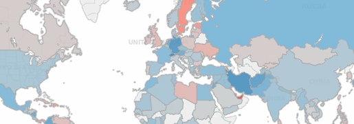
First, lets look at a metric that you won’t often find at the population level across countries- overall percentage of post-secondary completers, from 1950 to the present.
Here’s a similar time-lapse map, this time focusing on the relative differences between the overall and female rate of post-secondary completion in the national population (apologies if this enters me into the blue-for-boys, pink-for-girls nature/nurture debate, but I use that shorthand here). The color is calculated by subtracting the overall rate from the female rate, with negative numbers showing up as red. Note that because I’m using the overall rate as the comparison (as opposed to the male rate) differences are muted a bit.
To watch both overall post-secondary education and the associated female ratio change at once, controlled by one tracker, go to the dashboard here.
If we assume that the distribution of human capital across a country has implications for productivity, and that its effect is at least somewhat additive, then one way to compare nations is to multiply the average years of tertiary education times the population of the country to get a sense of the total years of tertiary education represented by the population. Because Barro and Lee use “4 years” as a catch-all for completing tertiary education and “2 years” as a catch-all for “some college,” it’s possible that these number may actually be underestimating a bit in the modern era as an increasing number of college graduates pursue graduate school, particularly in a subset of the advanced economies. This bubble chart color-codes circles based on their geographic region (for developing countries) or advanced economy status (blue). While the movement can be headache-inducing if you watch too many loops, it provides both a sense of the overall growth of international tertiary education as well as relative changes between countries while accounting for their populations. Perhaps most powerful is the contrast between the overwhelming dominance of the US until the 1980s or so when another block of countries starts to catch up, along with a reminder that while the United states increasingly lags other countries in our completion rates we still maintain a dominance in overall years of tertiary education in the broader population (though that’s perhaps something we can only expect to last for perhaps another couple of decades). Essentially, this captures the effects of national higher education policy for each country, with a lag for it to become distributed throughout the population.
This circle chart shows the changes in each of the measured levels of attainment- it provides both a sense of the areas where progress has been greatest over time, but also areas where emphasis appears to have been focused on a particular level of attainment (primary or secondary), with less focus (or at least success) in retention to the next level of education. One clear example is Sub-Saharan Africa, which surpassed South Asia in primary school attainment, but has only fallen further behind the region for secondary and tertiary schooling during that same period. The comparison is similar between Latin America and the Middle East/North Africa.
On the largest scale, though, we often talk about achievement gaps within countries, which are often characterized by whether they are narrowing or widening, regardless of whether raw achievement (however measured) is going up for both groups. This can be a helpful and thought-provoking way to think about disparities in education outcomes between countries or even, as with the line chart below, between groups of countries. The chart below uses a simple advanced economies vs. developing economies breakdown (the filter at right can be used to adjust the regions included in developing countries). There is a clearly visible trend across the board of a gap that is narrowing for primary education but widening for secondary and tertiary schooling (except possibly for Europe and Central Asia, where the gap is more stable). This, of course, happening in a context where developing countries are increasing along all levels of education, but the advanced economies are increasing at an even faster pace. Part of the reason this is not the case for primary schooling is that the advanced economies have largely topped-out; 6 years is considered the maximum for primary schooling, so advanced economies have largely already encountered “ceiling” to their attainment. By contrast, tertiary schooling is on the rise across all countries. There are obvious implications here for those interested in questions of inter-country inequality, and for those who study whether a particular level of education has stand-alone value or if its primary worth is in its relative rarity compared to its distribution in the marketplace. That’s a question of increasing importance as international education development moves beyond the relatively clear-cut outcomes of literacy, health, and basic math in primary school.
For those who like to glance through some of the underlying data, below is a chronological crosstab that looks at these same indicators- average years of primary, secondary, and post-secondary education- by country, using the Barro-Lee estimates. As with many of the other vizzes in this post, just use the slider to change the reference year.
As always, feedback, questions, and new angles to explore are always welcome.